While being engaged was a wonderfully blissful season in my life, I’ll be honest—I’m not going to miss planning my own wedding. Guys! It’s so much work! I’m passionate about design and insanely detailed oriented, which means that I obsessed over just about every detail of mine and Nate’s wedding. And while many people say that it’s silly to obsess over so many details, I don’t regret it one bit because of how fulfilling it was to see all of my hard work come together on our wedding day. Plus, I have all of our beautiful photos by Eden Strader to remember the small details by!
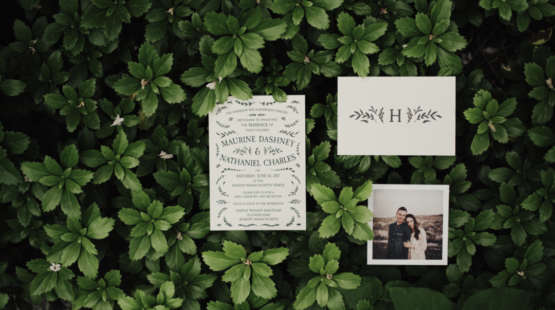
When I reflect on all of our wedding details, I think our wedding invitations may be my very favorite. I poured more time into them than I did into anything else, and it was such a fun process watching my design go from Illustrator to the printer to the finished product.
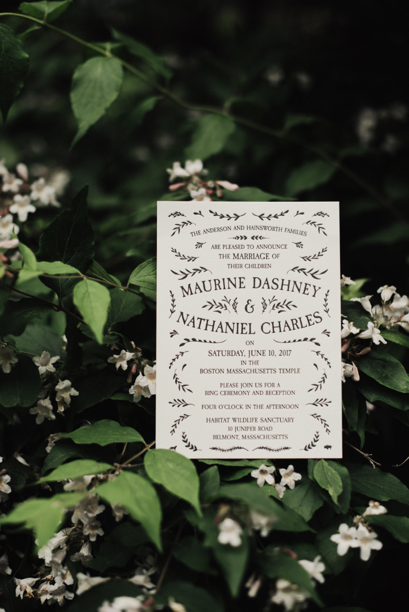
I’ve gotten a lot of questions about how I designed my wedding invitations and had them letterpressed, so I thought I’d give you a brief run-down of how I designed them.
- I purchased this handsketched clip art kit from Creative Market. It included just the right botanical details I wanted to include on my invitations.
- I created three separate files in Adobe Illustrator—one for the wedding invitation, one for the Utah open house insert, and one for the double sided RSVP card.
- I laid out text for all three pieces of the invitation suite.
- I gradually surrounded the text with various little pieces of clip art, mirroring each piece as I went to create a perfectly symmetrical design.
- Once I was finished with all of the designs, I prepared them for print by making everything black, converting all text to outlines, and saving each piece as a PDF.
- I sent my print-ready files to the friendly letterpress experts at Rowley Press for printing. I had a brief back-and-forth with them about ink color, paper type, etc.
- I not-so-patiently waited in the mail for our finished invitations.
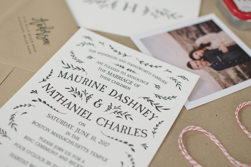
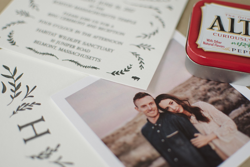
Btw, let’s take a moment to appreciate the bison I snuck onto the invitation. The bison is Nate’s spirit animal, and mine is the cheetah. There’s a cheetah in the opposite corner haha.
Assembling and sending out our invitations was another project of its own. Basically I added stamps to all of the RSVP postcards, had photos printed by Parabo Press, and tied everything together with red and white baker’s twine. While tying them together, I included a little tag that had a link to our wedding website so that people would know where to go for wedding and registry details (Yay! One less insert!) I used these envelopes because I thought they suited the whole botanical theme I was going for, and then I used the Lettermate to hand address all of the envelopes.
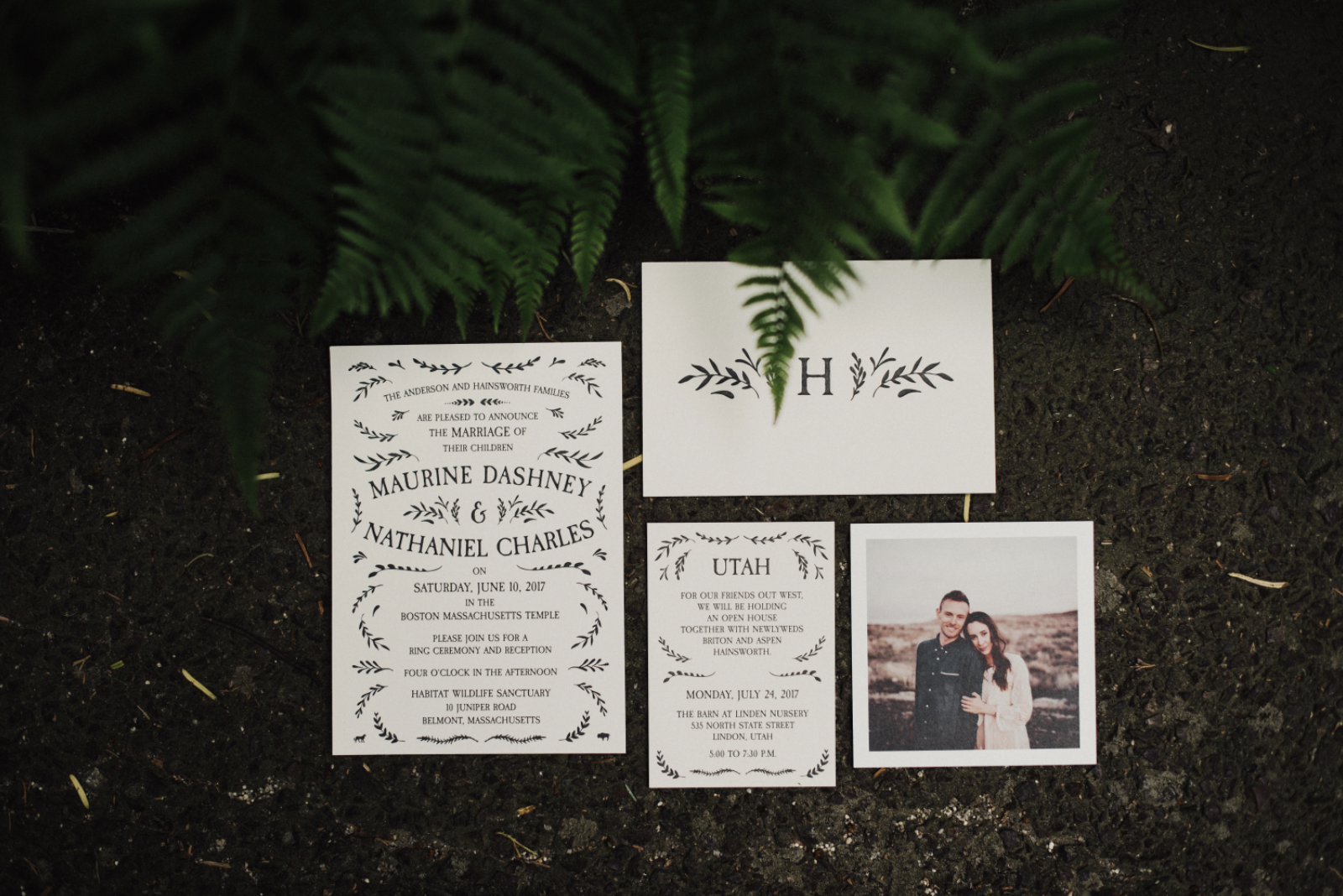
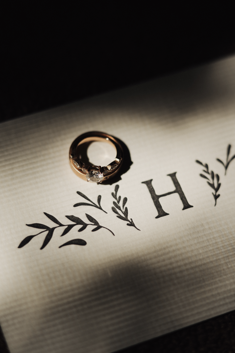 The artsy photos on here were taken by our wonderful wedding photographer, Eden Strader. The photos with my go-to kraft paper background were taken by me.
4 Comments
Hi Maurine,
I saw you recently got married back in June, and would love to share an idea with you! Email me when you get a chance! Thanks!
This invitation was adorable. It looked stellar on my fridge and I saved it for the future!
I have been reading out a few of your posts and i must say clever stuff. I will make sure to bookmark your blog.
Most what i read online is trash and copy paste but i think you offer something different. Keep it like this.