Today…I would like to talk about the ampersand. Well, more particularly, the origin of the ampersand. I know…weird, huh? But as you may know, I am just a tad obsessed with linguistics (it was one of my majors), which means that random tangents on punctuation and such will happen here on occasion. Plus I haven’t shared a factoid with you in a while.
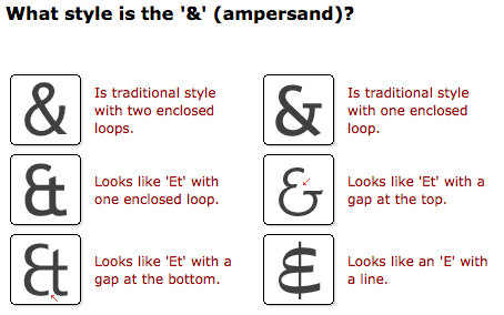
So, not too long ago I was playing around at identifont.com—an incredibly useful site that helps you identify fonts you’d like to know the name of—and came across this question asking what the ampersand of a particular font looked like:
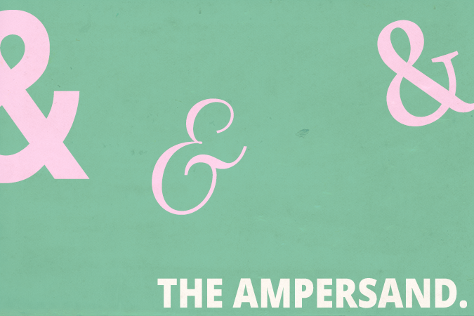
And suddenly…I saw where the ampersand came from. Do you see those two &s on the bottom left? Definitely “Et” smooshed together. And if you know Latin, you know that “Et” means ‘”and” (“et cetera,” anyone?) Take a look at the middle ampersand in my above graphic as well. Do you see what I mean?
That & is from Petit Formal Script, by the way. I think it’s my favorite one. Many serif typefaces exhibit this type of ampersand in their italic forms.
I need to stop getting so sidetracked in these blog posts.
So if you’d like to get fancy about it, you may now start calling the ampersand a ligature—when two or more letters are combined into a single glyph—of the “e” and “t” from Latin’s word for “and.”
And…this is what Wikipedia cites about it: ‘The word ampersand is a corruption of the phrase ‘and (&) per se and’, meaning ‘and (the symbol &) intrinsically (is the word) and‘.” I’ll let you unpack that sentence.
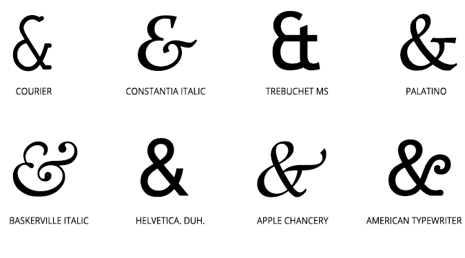
Here are some pretty ampersands to look at:
4 Comments
Finding the perfect ampersand is the Holy Grail of typography.
http://www.knoed.com/blog/a-selection-of-ampersands/
This is so helpful!
I didn't know that about the ampersand. So fun. It was nice meeting you today.
It was so great meeting you too. Love your blog!